
Why Does Mobile Optimization Matter in Technical SEO?
Mobile optimization plays a vital role in technical SEO because it directly affects how well your site performs in search rankings and how users engage with your content. As search engines shift toward mobile-first indexing, they give priority to websites that deliver smooth, user-friendly mobile experiences. Ensuring your site is responsive, loads quickly, and has easy-to-navigate pages are essential aspects that keep users satisfied and coming back. On top of that, well-optimized mobile sites tend to have lower bounce rates, which signals to search engines that your site is valuable, boosting your rankings. Focusing on touch-friendly designs and adaptable layouts will make sure your site works well across all devices, giving you a competitive edge. As mobile usage continues to surge, understanding these elements becomes increasingly essential for effective technical SEO strategies. Explore these mobile optimization techniques in technical SEO today!
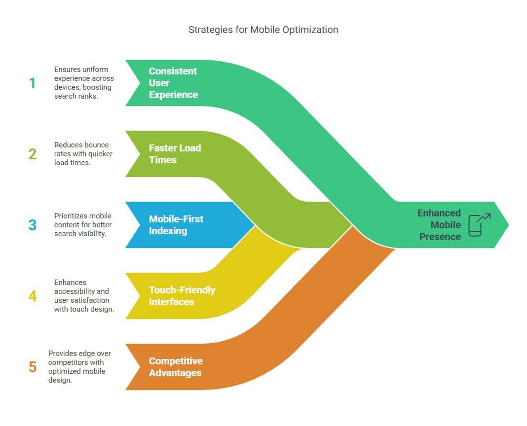
Key Takeaways
- By offering a consistent user experience across all devices, mobile optimization guarantees higher search ranks.
- Faster load times and responsive design lower bounce rates, which improves user retention and engagement.
- Mobile-optimized material is given priority via mobile-first indexing, which affects search engine ranking and visibility.
- Accessibility is improved with touch-friendly interfaces, which also increase user happiness and interaction.
- Competitive benefits are provided by optimized mobile design, which guarantees that websites stay relevant in a world that is increasingly mobile-centric.
Importance of Mobile-First Indexing
As smartphones have become the most popular means of internet access, mobile-first indexing has emerged as a crucial component of technical SEO. This change highlights how crucial it is to comprehend mobile user behavior, which has a big impact on how material is shown and used on mobile devices. If websites don’t adjust to these practices, they run the risk of being less visible and engaging in search engine results.
In order to meet the requirements of a mobile-first index, responsive design approaches are crucial. By ensuring that online pages are adaptable to different screen sizes, these strategies increase user satisfaction and accessibility. By emphasizing succinct, pertinent material that meets the needs of users who are constantly on the go and want rapid and effective access to information, a well-executed mobile content strategy enhances responsive design.
The implementation of Accelerated Mobile Pages (AMP) provides notable benefits in this context. AMP enhances page loading speed, a crucial factor in retaining mobile users who expect fast interactions. This speed not only improves user experience but also contributes positively to search engine rankings, as load time is a significant ranking factor.
To navigate the complexities of mobile-first indexing, businesses can leverage mobile SEO tools that offer insights into mobile performance and optimization opportunities. These tools assist in evaluating site elements such as load speed, mobile-friendliness, and overall usability. By employing a comprehensive approach that integrates responsive design, mobile content strategies, and the advantages of AMP, organizations can effectively align with mobile-first indexing requirements, ensuring their websites remain competitive in an increasingly mobile-centric digital landscape.
Enhancing User Experience

As mobile-first indexing reshapes the digital landscape, enhancing user experience emerges as a pivotal element for maintaining competitive advantage. In an era where mobile devices are the primary tools for accessing the internet, ensuring optimal user interaction is crucial. Responsive design is at the forefront of this initiative, allowing websites to automatically adjust their layout based on varying screen sizes. This flexibility ensures that content remains legible and aesthetically pleasing, irrespective of the device being used.
Touch navigation plays a significant role in improving mobile accessibility and user engagement. Unlike desktop interfaces that rely heavily on clicks, mobile platforms demand intuitive touch interfaces that facilitate seamless interaction. Features such as swipeable menus and touch-friendly buttons enhance the browsing experience, making it more intuitive and efficient for users. By prioritizing these elements, businesses can significantly improve their user engagement metrics, leading to longer session durations and reduced bounce rates.
Mobile accessibility goes beyond just layout adjustments; it requires meticulous attention to content delivery. Fast load times, easy readability, and accessible multimedia content ensure users remain engaged. Here are three key strategies to enhance user experience:
- Implement responsive design: Adapt layouts to fit various screen sizes, ensuring a consistent experience across devices.
- Optimize touch navigation: Design intuitive interfaces that accommodate natural touch gestures, enhancing overall usability.
- Prioritize mobile accessibility: Ensure fast loading times and accessible content to maintain user engagement and satisfaction.
Impact on Search Rankings

In the realm of technical SEO, mobile optimization significantly influences search rankings, directly impacting a website’s visibility and discoverability. As mobile algorithms increasingly prioritize sites optimized for mobile devices, businesses must focus on this critical aspect to maintain or enhance their search visibility. The shift toward mobile-first indexing by search engines underscores the importance of mobile optimization, where elements such as responsive design, page speed, and user engagement become pivotal ranking factors.
A well-optimized mobile site not only improves user experience but also offers a competitive advantage in search rankings. As more users access content via mobile devices, search engines reward websites that deliver seamless experiences across all devices. This focus on user satisfaction aligns with Google’s ongoing commitment to enhance search results, rewarding sites that prioritize mobile usability.
| Key Factor | Impact on Rankings |
| Mobile Algorithms | Determine priority in SERPs |
| User Engagement | Higher engagement improves |
| Competitive Advantage | Stand out against competitors |
Mobile algorithms are designed to evaluate how effectively a website performs on smartphones and tablets. Sites that cater to the needs of mobile users often experience increased user engagement, leading to better search ranking positions. This engagement signals to search engines that the content is valuable and relevant, which can further boost rankings.
Faster Page Load Times

Faster page load times are a crucial element of mobile optimization in technical SEO, directly influencing user experience and search engine rankings. In today’s digital landscape, users expect instant access to information, and any delay can lead to increased bounce rates and diminished engagement. To achieve optimal load times, employing responsive design strategies is essential. These strategies ensure that websites automatically adjust to different screen sizes, providing a seamless user experience across all devices. Moreover, responsive designs contribute to faster load times by eliminating unnecessary elements that can slow down page rendering.
Utilizing mobile testing tools is another vital step in refining page load speeds. These tools help identify bottlenecks and provide actionable insights into areas that require optimization. By leveraging mobile analytics insights, organizations can pinpoint specific elements that contribute to slower load times, allowing for targeted improvements.
Here are three effective practices to enhance mobile page load times:
- AMP Implementation Benefits: Accelerated Mobile Pages (AMP) streamline HTML code, enabling faster loading on mobile devices. The benefits of AMP include improved performance and better user engagement, which can positively impact SEO.
- Image Optimization Techniques: Reducing image sizes without compromising quality is key to decreasing load times. Techniques such as compression and using modern formats like WebP can lead to significant improvements in speed.
- Responsive Design Strategies: Implementing a mobile-first approach ensures that websites are built to perform optimally on mobile devices from the outset. This strategy not only enhances speed but also provides a consistent user experience.
Mobile-Friendly Web Design

Creating a mobile-friendly web design is an essential component of effective technical SEO, ensuring that websites are easily navigable and visually appealing on mobile devices. As mobile use continues to rise, incorporating responsive design trends becomes increasingly critical. Responsive design ensures that web content adapts seamlessly to various screen sizes and orientations, providing an optimal viewing experience across all devices. This approach not only enhances user satisfaction but also positively impacts search engine rankings, as search engines prioritize mobile-friendly sites.
To achieve this, web developers must consider several key aspects. Implementing adaptive layouts benefits users by automatically adjusting elements such as images, text, and navigation based on the specific device being used. This prevents common issues like horizontal scrolling and distorted images, which can detract from the user experience. Furthermore, touch friendly interfaces are crucial, as they facilitate intuitive interaction via taps and swipes rather than clicks, which are more suited for desktop navigation.
In addition to these design elements, rigorous mobile usability testing should be conducted to identify and rectify any potential issues that may impede the user experience. This testing ensures that navigation, accessibility, and functionality are all optimized for mobile users, ultimately leading to increased user engagement and retention. Screen size considerations must be taken into account during the design phase, as different devices, from smartphones to tablets, present unique challenges and opportunities for displaying content effectively.
Improving Site Navigation
Effective site navigation serves as a cornerstone of technical SEO, ensuring that users can effortlessly explore and engage with a website’s content. In the realm of mobile optimization, improving site navigation is crucial for enhancing mobile usability and providing a seamless user experience. A responsive layout guarantees that navigation elements adapt to various screen sizes, ensuring accessibility across all devices. This adaptability is vital for maintaining a coherent navigation hierarchy, which guides users intuitively through a website’s structure.
Incorporating touch friendly elements is another critical aspect of mobile optimization. Elements such as buttons and links should be large enough to be easily selectable on touchscreens, minimizing user frustration and enhancing engagement. Consideration of touch targets is essential for reducing error rates and ensuring that users can interact with content efficiently.
Here are three strategies to enhance site navigation for mobile users:
- Responsive Layouts: Implementing flexible grids and layouts that automatically adjust to the device’s screen size ensures a consistent user experience. This approach supports adaptive content delivery, allowing users to access information seamlessly.
- Touch Friendly Elements: Design navigation bars and menus with larger touch targets to facilitate easy interaction. This consideration is vital for improving mobile usability and preventing accidental clicks.
- Clear Navigation Hierarchy: Organize content logically, using dropdowns or collapsible menus to present information in a structured manner. This hierarchy helps users locate desired content quickly and efficiently, enhancing overall satisfaction.
Reducing Bounce Rates
Reducing bounce rates is a critical component of mobile optimization in technical SEO, as it directly impacts user retention and engagement. When users land on a mobile site that isn’t well-optimized, they are likely to leave quickly, leading to high bounce rates. This behavior is largely influenced by mobile user behavior, which demands fast, seamless navigation and easy access to information. Ensuring mobile device compatibility through responsive design principles is essential to meet these expectations.
Responsive design principles enable websites to adapt to various screen sizes and orientations, improving user experience. This adaptation is crucial because it aligns with how users interact with their devices, taking advantage of touch screen optimization. A site that is not touch-friendly can frustrate users, causing them to exit swiftly, thus increasing bounce rates. Therefore, touch screen optimization should be a priority to retain visitors.
Effective mobile traffic analysis provides insights into user behavior, allowing for adjustments that can reduce bounce rates. By understanding where users drop off, businesses can pinpoint issues and optimize content and navigation accordingly.
Here’s a simplified table to illustrate factors affecting bounce rates:
| Factor | Impact on Bounce Rates | Solution |
| Mobile User Behavior | Increases if negative | Improve user experience |
| Mobile Device Compatibility | Crucial for retention | Ensure responsive design |
| Responsive Design Principles | Essential for adaptation | Implement fluid layouts |
| Touch Screen Optimization | Affects user interaction | Enhance touch-friendly features |
Addressing these factors through mobile optimization not only reduces bounce rates but also enhances overall site performance, leading to improved user satisfaction and better SEO outcomes.
Final Thoughts
Mobile optimization is no longer optional but a fundamental part of technical SEO strategies. Ensuring your site is mobile-friendly directly impacts user engagement, bounce rates, and ultimately, your search engine rankings. Prioritizing fast page load times, implementing responsive designs, and enhancing site navigation for mobile users are all key factors that help improve the overall user experience. As mobile-first indexing becomes the norm, optimizing for mobile ensures that your website remains competitive, relevant, and well-positioned to meet the demands of an increasingly mobile-centric audience.
Ready to optimize your website for mobile and boost your search rankings? Contact Syville Gacutan, an experienced SEO Specialist in the Philippines. Syville can help you enhance your site’s mobile performance, improve user engagement, and achieve sustainable SEO success. Connect today for expert guidance and proven SEO solutions!