
To structure your site menu for SEO, focus on creating a clear, user-friendly navigation system that enhances both user experience and search engine accessibility. Start by organizing menu items logically with familiar terms, ensuring essential pages are prioritized to reflect the user’s journey. Make websites work well on mobile devices. Use simple icons like three horizontal lines for easy menu access. A well-defined site hierarchy, aided by breadcrumb trails, can further guide users efficiently and boost content indexing. Additionally, ensure that URL structures are concise, descriptive, and consistent. Continue to explore these aspects to refine your site’s navigation and SEO strategy.
Key Takeaways
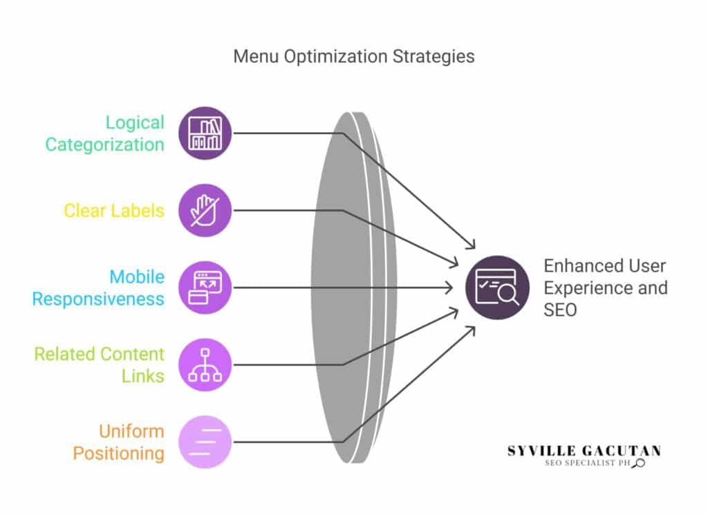
- Organize menu items into clear, logical categories to improve user navigation and SEO.
- Employ brief clear labels within menus. This approach improves user comprehension and search engine indexing capabilities.
- Ensure the menu is responsive for mobile devices, using expandable designs like hamburger icons.
- Add links inside menus that direct users to related content. This improves search engine optimization.
- Ensure menus are positioned and named in a uniform manner. This approach fosters confidence and enhances the overall user experience.
Importance of Website Navigation
Effective website navigation is a cornerstone of both user experience and search engine optimization (SEO). The menu serves an important purpose in this system. It guides people and search engines. A well-structured menu not only helps users effortlessly find the information they seek but also enhances the overall navigation for SEO.
By providing clear pathways and connections between different pages, the menu contributes significantly to the structure of your website, ensuring that it is logical, intuitive, and easy to follow.
Search engines prioritize websites that offer a user-friendly experience, and a coherent navigation system is fundamental to achieving this. If users find the required information effortlessly they tend to interact more with the content. This leads to fewer visitors leaving quickly and more time spent on the website.
These factors, in turn, send positive signals to search engines, potentially improving the site’s ranking.
Moreover, the structure of your website should be designed with the end user in mind. A user-friendly website is one where the navigation menu is not overcrowded or confusing but rather straightforward and relevant.
This simplicity aids in swiftly guiding users to their desired content, minimizing frustration and enhancing satisfaction.
Designing User-Friendly Menus

Creating a user-friendly menu is essential for enhancing both the functionality and accessibility of a website. A well-designed menu improves user experience by providing clear and concise navigation options, enabling visitors to locate information effortlessly. The key to achieving this lies in constructing an intuitive navigation structure that prioritizes user needs and preferences.
To begin with, menu options should be logically organized and labeled with familiar terms that resonate with your audience. This approach aids in reducing cognitive load and allows users to navigate your site efficiently.
In the era of mobile browsing, it is crucial to ensure that the mobile version of your site offers a seamless menu experience. Responsive design is not just a trend but a necessity, as it allows for optimal viewing and interaction across various devices. Implementing expandable menus or hamburger icons can be effective strategies for mobile navigation, ensuring that the menu options remain accessible without consuming excessive screen space.
Furthermore, internal linking within the menu plays a pivotal role in guiding users through related content, enhancing the overall user experience. By strategically linking relevant pages, you encourage exploration and keep users engaged longer. This not only improves user satisfaction but also aids in search engine optimization by distributing link equity throughout your site.
Structuring Site Hierarchy
A well-designed menu sets the stage for an effective site hierarchy, which is foundational to both user experience and SEO. An optimized navigation structure not only aids search engine crawlers in understanding the content and purpose of your site but also enhances the user’s ability to find information effortlessly. A clear hierarchy ensures that key pages are accessible within minimal clicks, thus improving both engagement and conversion rates.
To achieve a robust site hierarchy, begin by categorizing content into primary and secondary groups. This stratification informs the website navigation, ensuring that high-priority pages receive prominence in the menu for SEO purposes. Employing best practices, such as a top-level menu that features broad categories, allows users to quickly identify the general areas of interest before delving into more detailed subcategories. This hierarchical approach aids in establishing thematic relevance, which search engines leverage to rank pages accordingly.
Moreover, consistency in site navigation is crucial. Uniformity in labels and placement helps users form mental models of your site’s structure, fostering ease of access.
When designing your navigation structure, avoid overcomplicating it with excessive links. Instead, focus on creating a streamlined path that guides users logically through the website navigation, minimizing potential confusion.
Role of Breadcrumb Trails

How do breadcrumb trails contribute to both user experience and SEO effectiveness? Breadcrumb trails serve as a secondary navigation aid that enhances the user experience by offering a clear path back to previously visited sections of a website.
These trails, typically found at the top of a webpage, display the user’s current location within the site’s hierarchy, streamlining the navigation process. This structured layout not only aids users in efficiently finding specific content but also encourages them to explore additional pages.
By presenting navigation links in a logical sequence, breadcrumb trails minimize the likelihood of users getting lost or frustrated, thereby enhancing their overall experience.
From an SEO perspective, breadcrumb trails significantly impact website effectiveness. Search engines, like Google, use breadcrumb trails to understand the site’s structure and the relationship between different pages.
This comprehension aids in indexing and can improve the visibility of specific content within search results. When breadcrumb trails are implemented correctly, they provide search engines with contextual signals about the hierarchy and relevance of the pages, which can contribute to better rankings.
Furthermore, breadcrumb trails can enhance click-through rates by displaying navigation links within search engine results. When users see a clear path to specific content, they are more likely to click on the link, leading to increased site traffic.
Enhancing Mobile Navigation
As websites continue to prioritize seamless user experience and effective SEO strategies, attention must also be directed towards optimizing mobile navigation. With the proliferation of mobile devices, ensuring that users can easily navigate a website on smaller screens is paramount. A well-crafted menu that works on mobile devices is integral in providing the best user experience. It ensures that users are able to navigate your site effortlessly, which can significantly impact how long they stay and engage with your content.
To enhance mobile navigation, the design of your navigation options should be intuitive and accessible. Simplifying the menu structure can help in reducing cognitive load for users. Implementing a hamburger menu, for example, can be an effective way to keep the interface clean while still offering easy access to various sections of your site. This approach can consolidate navigation options without overwhelming the user.
Furthermore, ensuring that the menu items are clearly labeled and logically grouped can improve usability. Users should be able to anticipate what they will find in each section, which requires thoughtful categorization and labeling.
It is also essential to test the mobile navigation across different devices and screen sizes to ensure consistent functionality. Incorporating responsive design principles can further enhance the mobile experience. This means the menu should adapt fluidly to different screen dimensions, maintaining usability and accessibility.
Optimizing URL Structure

Optimizing your website’s URL structure is a critical component of effective SEO strategy. A well-structured URL is not just a minor detail; it plays a significant role in enhancing the user experience and aiding search engines in understanding your site’s hierarchy. The menu is important in this context, as a logical URL structure can mirror your navigation menu, creating an intuitive pathway for both users and search engine crawlers.
When you structure your website, aim for URLs that are concise yet descriptive, reflecting the content they represent. This entails using keywords wisely to enhance relevance without resorting to keyword stuffing. A clear, organized URL structure can significantly optimize the way search engines interpret the context and content of your pages, thereby boosting your site’s visibility in search engine results.
Consistency is another essential aspect. As you design your navigation menu, ensure that your URL structure remains consistent across your domain. Avoid using superfluous parameters or overly complex hierarchies. Simplicity aids both the user and the search engine in navigating your site effectively.
Furthermore, using hyphens to separate words in a URL is preferable, as it improves readability for both users and search engines. As you optimize, remember that URLs should be lowercase and devoid of unnecessary punctuation, which can confuse search engines and users alike.
Utilizing Navigation Labels

Building on the foundation of a well-structured URL, the role of navigation labels in your site’s menu becomes apparent. Effective labels for your navigation are instrumental in guiding both search engines and users through your website. They serve as signposts on your navigation bar, illuminating the path to relevant content. A thoughtfully crafted menu, with precise and descriptive menu items, ensures that users can navigate your site with ease while simultaneously signaling to search engines the most critical components of your site’s architecture.
The emotional impact of effective navigation labels can be visualized in the table below:
| Emotion | User Experience |
| Clarity | Users feel empowered and in control, knowing exactly where links will take them. |
| Frustration | Ambiguous labels cause confusion, leading users to abandon the site. |
| Satisfaction | Clear labels enhance the joy of discovery and user engagement. |
| Trust | Consistent and predictable navigation builds a sense of reliability. |
| Anxiety | Vague or misleading labels increase user apprehension and dissatisfaction. |
Crafting navigation labels requires a balance of creativity and precision. Aim for simplicity and relevance, ensuring each label is a concise reflection of the content it represents. Avoid jargon and overly clever language that might obscure the menu’s purpose. Instead, focus on universally understood terms that enhance accessibility.
Furthermore, consider the hierarchy and order of your menu items. Prioritize essential pages, aligning them logically to mirror the user’s journey. This strategic approach not only enhances user experience but also strengthens your site’s SEO, as search engines favor well-organized, easily navigable websites. By optimizing your navigation labels, you enhance the usability and discoverability of your site, fostering both user satisfaction and search engine favorability.
Improving Page Load Speed

Page load speed is a critical factor in both user experience and search engine optimization. As users increasingly demand quicker access to information, ensuring that your site menu works efficiently is paramount. Slow page load speed can deter users from exploring your site further, leading to higher bounce rates and potentially impacting your search engine rankings.
Therefore, optimizing load times is not just about enhancing user satisfaction but also about maintaining visibility in search results.
To ensure users find what they need quickly, it is essential to streamline the structure and functionality of your site menu. A well-designed menu works by organizing important content logically and intuitively, allowing users to navigate without unnecessary delays. This involves minimizing the use of heavy graphics or complex scripts that can slow down load times.
Instead, opt for lightweight design elements and efficient coding practices to maintain a swift user experience.
Consider employing techniques such as asynchronous loading for non-essential elements or utilizing a content delivery network (CDN) to distribute content more efficiently. Additionally, compressing images and leveraging browser caching can significantly improve page load speed, ensuring users access important content with minimal wait times.
A great menu not only facilitates easy navigation but also enhances the overall page load speed by being optimized for performance.
Final Thoughts
To effectively structure your site menu for SEO, focus on clarity, simplicity, and logical organization. Well-structured navigation helps users find content easily, improving both user experience and engagement, while ensuring that search engines can index pages efficiently. Prioritize responsive design for mobile devices and ensure that labels, URLs, and breadcrumb trails are consistent and descriptive. A streamlined hierarchy and intuitive menu system not only boost SEO performance but also create a seamless browsing experience that encourages visitors to explore further, ultimately increasing user satisfaction and conversion rates.
Need expert help optimizing your website’s menu for better SEO? Connect with Syville Gacutan, an experienced SEO Specialist in the Philippines, who can transform your site navigation, enhance user experience, and boost your search engine rankings. Contact Syville now for professional SEO guidance that drives results!