
5 Best Mobile Optimization Techniques for Technical SEO
Improving technical SEO requires a thorough understanding of mobile optimization. By using responsive design, you can make sure that your website works well on a range of devices, increasing user engagement and usability. Accelerated Mobile Pages (AMP) significantly reduce load times, bolstering user experience and search engine rankings. Structuring content to be mobile-friendly enhances navigation and readability. Optimizing site speed through efficient image management and server response times further improves user satisfaction and SEO performance. Implementing structured data increases visibility and click-through rates in search results. Explore these mobile optimization techniques in technical SEO to fully leverage their potential in optimizing your site for mobile users.
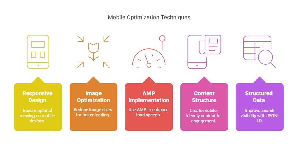
Key Takeaways
- Use responsive design to guarantee the best possible viewing and usability on all mobile devices.
- Reduce picture sizes and enhance server response times to make your site load faster.
- To speed up load times and improve the mobile user experience, employ Accelerated Mobile Pages (AMP).
- To engage consumers, prioritize a mobile-friendly content structure with clear language and touch-friendly navigation.
- Enhance search visibility and click-through rates in mobile search results by integrating structured data using JSON-LD.
Importance of Mobile Optimization

It is impossible to overestimate the significance of mobile optimization in the current digital environment. Businesses must give the mobile user experience top priority in light of the growing popularity of smartphones and tablets in order to satisfy their target audience. Due to mobile-first indexing, a flawless mobile experience is not only essential for user pleasure but also has a big impact on search engine rankings. Major search engines like Google have adopted this practice, which gives priority to a website’s mobile version for indexing and ranking purposes. As a result, mobile optimization is a crucial part of any effective SEO strategy.
Additionally, users’ interactions with mobile devices are changing due to the popularity of voice search optimization. Content must be optimized to support natural language queries as more people turn to voice-activated assistants for information. This change calls for an emphasis on conversational keywords and brief responses that accommodate voice search users.
Touch screen usability is another critical aspect of mobile optimization. Ensuring that websites are easily navigable on smaller screens, with touch-friendly interfaces, enhances user engagement and satisfaction. Elements such as larger buttons, intuitive gestures, and responsive design contribute significantly to the overall mobile user experience.
Additionally, local search optimization is vital for businesses aiming to capture the attention of nearby customers. Mobile users frequently search for local information, such as business addresses and operating hours, making it crucial for companies to optimize their online presence accordingly. By ensuring accurate and up-to-date local listings, businesses can capitalize on local search traffic, ultimately driving foot traffic and increasing revenue.
Understanding Technical SEO
Frequently overlooked yet fundamentally crucial, technical SEO encompasses the underlying framework that enables search engines to efficiently crawl, index, and rank a website. As mobile user behavior continues to evolve, understanding the intricacies of technical SEO becomes essential for optimizing a website’s mobile experience. With the rise of mobile first indexing, search engines prioritize mobile-optimized websites, making it imperative for businesses to adapt.
| Aspect | Description |
| Mobile User Behavior | Analyzing how users interact with mobile websites to optimize content flow. |
| Mobile SEO Tools | Utilizing platforms to identify and resolve mobile-specific SEO issues. |
| Mobile Analytics Tracking | Monitoring user engagement and performance metrics on mobile devices. |
| Voice Search Optimization | Adapting SEO strategies to cater to voice search queries and commands. |
| Mobile First Indexing | Ensuring the mobile version of a site is prioritized in search engines. |
Mobile SEO tools play a pivotal role in identifying and rectifying mobile-specific issues that could hinder a site’s search engine performance. These tools provide insights into areas such as page speed, usability, and mobile-friendly design, critical for maintaining competitiveness in search rankings.
Mobile analytics tracking enables businesses to monitor how users engage with their mobile site, offering data-driven insights to refine user experience and improve conversion rates. As voice search optimization becomes increasingly prevalent, understanding user intent and adapting content to fit conversational queries is vital.
The transition to mobile first indexing signifies a paradigm shift in how search engines evaluate and rank websites. Ensuring that the mobile version of your site is well-optimized is no longer optional but essential. By focusing on these technical SEO elements, businesses can enhance their online visibility and adapt to the dynamic landscape of mobile search.
1. Responsive Design Implementation

Responsive design serves as the cornerstone of a successful mobile SEO strategy, ensuring that a website delivers a seamless user experience across various devices and screen sizes. By implementing responsive design, websites can adapt to different screen dimensions, which is crucial in today’s digital landscape where users access content from multiple devices. One of the key components of responsive design is the use of adaptive layouts. These layouts automatically adjust to the screen size, providing an optimal viewing experience without requiring separate mobile and desktop versions of a site.
A critical aspect of responsive design is setting the correct viewport settings. The viewport meta tag instructs browsers on how to adjust the page’s dimensions and scaling to match the device’s screen, thereby enhancing readability and usability. Furthermore, designing for mobile requires consideration of touch targets. Touch targets, such as buttons and links, should be appropriately sized and spaced to accommodate users’ fingertips, reducing accidental clicks and improving navigation.
Mobile navigation is another essential element in responsive design. A streamlined navigation system ensures users can easily access the content they need without excessive scrolling or searching. This aspect is critical for maintaining user engagement and reducing bounce rates.
Lastly, image optimization plays a pivotal role in responsive design. By optimizing images for different devices, websites can decrease load times, which directly impacts the user experience and SEO performance.
- Adaptive layouts adjust content to screen sizes.
- Viewport settings enhance device compatibility.
- Touch targets improve usability and navigation.
- Mobile navigation ensures efficient content access.
- Image optimization reduces load times and enhances performance.
Incorporating these elements into a responsive design framework is vital for achieving optimal technical SEO results.
2. Accelerated Mobile Pages (AMP)
Accelerated Mobile Pages (AMP) represent a significant innovation in mobile SEO, designed to enhance the speed and performance of web pages on mobile devices. Developed by Google, AMP focuses on delivering a lightweight version of web pages, enabling faster loading times, which is critical in a world where mobile browsing is predominant. The AMP framework streamlines code and optimizes resource loading, ensuring users experience minimal latency.
The table below summarizes key considerations in adopting AMP:
| Aspect | Details |
| AMP Benefits | Improved load times, enhanced user experience, and potential SEO boosts. |
| AMP Implementation | Requires a new HTML framework; careful planning and coding adjustments. |
| AMP vs. Responsive | AMP prioritizes speed; responsive design focuses on adaptable layouts. |
| AMP Caching | Utilizes Google AMP Cache to deliver content swiftly from global servers. |
AMP benefits are particularly notable in enhancing user engagement and retention by drastically reducing bounce rates. In terms of AMP implementation, developers need to employ a specific set of HTML tags optimized for speed, which may require a shift from traditional web development practices. This divergence highlights the contrast in AMP vs. responsive design, where AMP’s primary goal is speed optimization, while responsive design focuses on flexible display across devices.
Moreover, AMP caching plays a vital role in performance enhancement. By leveraging Google’s AMP cache, content is served from servers closer to the user, reducing load times significantly. This process not only enhances user experience but also can improve search engine rankings due to the importance of speed in SEO.
Lastly, AMP analytics provide insights into user interactions and performance metrics, allowing for data-driven strategies to further optimize web experiences. By integrating these insights, businesses can refine their approach, ensuring their mobile presence is as effective as possible.
3. Mobile-Friendly Content Structure

Crafting a mobile-friendly content structure is crucial for optimizing user experience and enhancing search engine visibility. In today’s digital landscape, where mobile devices reign supreme, designing a mobile content layout that captivates and engages is indispensable. A well-structured mobile site not only appeals to users but also aligns with search engine algorithms that prioritize mobile responsiveness.
A pivotal aspect of user experience design is ensuring touch friendly navigation. Users should be able to effortlessly tap, swipe, or scroll to access content. This involves scaling buttons and links appropriately, providing ample spacing, and minimizing the need for zooming or horizontal scrolling. The navigation should be intuitive, guiding users seamlessly through the site, thus reducing bounce rates and increasing engagement.
Equally important are text readability factors. Mobile screens are smaller, making it vital to use legible fonts and adequate contrast for easy reading. Paragraphs should be concise, and headings should be well-structured to allow users to skim through content quickly. This not only enhances user satisfaction but also aids in retaining visitors longer on the site.
Incorporating multimedia optimization techniques is also essential. Images, videos, and other multimedia elements enrich the content but can be detrimental if not optimized for mobile viewing. Using responsive images and fast-loading video formats ensures that multimedia enhances rather than hinders the mobile experience.
To summarize, a mobile-friendly content structure can be achieved through:
- Prioritizing mobile content layout
- Implementing touch friendly navigation
- Focusing on text readability factors
- Utilizing multimedia optimization techniques
- Enhancing overall user experience design
4. Optimizing Site Speed

Building on the foundation of a mobile-friendly content structure, enhancing site speed is another key component in optimizing a website for mobile users. Site speed significantly impacts user experience and search engine ranking, making it essential for technical SEO practitioners to prioritize it. One crucial aspect of site speed optimization is image optimization. By compressing images without sacrificing quality and using formats like WebP, websites can reduce load times, offering faster access to content for mobile users.
Furthermore, server response time plays a pivotal role in site speed. A sluggish server can delay the delivery of content, frustrating users and negatively affecting search rankings. To improve server response times, consider upgrading your hosting plan, optimizing databases, and minimizing server requests.
Implementing effective caching strategies is another technique to enhance site speed. Caching temporarily stores data, reducing the amount of information that needs to be loaded each time a user revisits a site. This not only speeds up the loading process but also lightens the load on the server, improving overall performance.
Mobile redirects also deserve attention. Improperly configured redirects can slow down site speed and adversely affect the user experience. Ensure that redirects are minimal and efficient to maintain optimal performance.
Ultimately, a swift site significantly elevates the user experience, encouraging longer visits and potentially higher conversions. By focusing on image optimization, server response, caching strategies, and mobile redirects, website owners can ensure their sites are not only mobile-friendly but also quick to load, meeting the expectations of today’s mobile users.
5. Implementing Structured Data

Structured data implementation is an essential aspect of enhancing a website’s SEO, particularly for mobile optimization. By providing search engines with explicit clues about the meaning of a page, structured data benefits mobile SEO by enabling rich results and improving visibility on search engine results pages (SERPs). To harness these benefits effectively, it’s crucial to understand proper implementation strategies, avoid common pitfalls, and stay informed about future trends in structured data.
Implementation strategies involve using formats like JSON-LD, which is recommended by Google for its simplicity and flexibility. Marking up relevant data types such as products, reviews, and events can significantly enhance the mobile user experience by providing immediate, actionable information. However, one must avoid common pitfalls such as using incorrect schema types or failing to keep structured data consistent with on-page content.
To ensure structured data is implemented correctly, utilizing testing tools like Google’s Rich Results Test is vital. This tool verifies the accuracy and validity of structured data, allowing you to identify and rectify errors before they impact mobile performance. As mobile search evolves, keeping abreast of future trends, such as the increasing importance of voice search and AI-driven search personalization, will be key to maintaining competitive SEO advantages.
- Structured data benefits: Enhances visibility and click-through rates.
- Implementation strategies: Use JSON-LD and focus on relevant data types.
- Common pitfalls: Avoid incorrect schema and inconsistency with content.
- Testing tools: Employ Google’s Rich Results Test for validation.
- Future trends: Prepare for voice search and AI-driven search personalization.
Final Thoughts
Mobile optimization is critical for improving technical SEO and ensuring a smooth user experience across devices. By implementing responsive design, enhancing site speed with AMP and image optimization, creating a mobile-friendly content structure, and utilizing structured data, you can significantly improve your website’s visibility and performance on search engines. Prioritizing these mobile optimization techniques helps capture the growing mobile audience and aligns your website with best practices for modern SEO, ultimately leading to better rankings and increased user engagement.
Ready to boost your website’s mobile SEO performance? Contact Syville Gacutan, an experienced SEO Specialist in the Philippines. Syville can help you optimize your site for mobile users, enhance search visibility, and achieve sustainable SEO success. Connect today for expert guidance and proven SEO solutions!