
Beginners in navigation design often make critical errors like overloading menus, which leads to user confusion and increased abandonment rates. Using vague labels can further impede information retrieval, causing frustration. Failing to ensure mobile responsiveness results in high bounce rates, harming both user engagement and search engine visibility. Skipping the search function limits user ability to find information quickly, while inconsistent design elements disorient and confuse users. Additionally, neglecting breadcrumbs and omitting user experience testing can impair navigation efficiency and reduce user satisfaction. Addressing these issues can significantly improve usability and ensure a more positive user interaction experience.
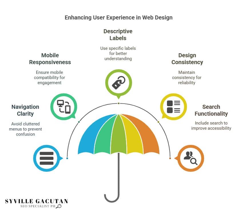
Key Takeaways
- Avoid cluttered navigation menus to prevent user confusion and frustration.
- Ensure mobile responsiveness to enhance user engagement and brand credibility.
- Use specific and descriptive labels for better content understanding and navigation.
- Maintain design consistency to foster reliability and seamless user experience.
- Include a search function to improve accessibility and user satisfaction.
Overloading the Navigation Menu

A cluttered navigation menu can significantly impair a website’s usability. An excessive number of navigation choices packed within a solitary menu results in bewilderment hindering users from locating their desired content or functionality with ease. A frequent error on websites involving navigation can annoy visitors. It might make them leave before looking at the actual content.
An overloading of the navigation menu not only disrupts the visual hierarchy but also hampers the user’s journey, undermining the primary goal of intuitive navigation.
In the quest for a user-friendly experience, it’s imperative to streamline the navigation menu. Prioritizing essential links and categorizing them effectively helps in maintaining clarity and focus. This approach minimizes cognitive overload for users, allowing them to seamlessly navigate through the site.
By reducing the number of navigation options, users can more easily identify the most relevant paths to follow, enhancing their overall experience.
Additionally, employing a well-thought-out structure for the navigation menu is crucial. Grouping related items under broader categories can simplify the navigation process. This practice not only aids in intuitive navigation but also contributes to a cleaner, more organized interface that resonates with user expectations.
Ultimately, avoiding the pitfall of overloading the navigation menu is vital for maintaining a user-friendly website. By focusing on clarity and simplicity, web designers can create an environment where users feel comfortable and confident in exploring.
The careful strategy enhances user-friendliness. Also it bolsters the website’s capacity to captivate and maintain its audience successfully.
Ignoring Mobile Responsiveness

While streamlining the navigation menu is fundamental to enhancing user experience, ensuring mobile responsiveness is equally important in today’s digital landscape.
With a significant portion of web traffic originating from mobile devices, neglecting a responsive design can severely impact user engagement and retention. Users expect seamless website navigation regardless of the device they use, and failing to deliver can lead to a high bounce rate, where visitors leave your site almost as quickly as they arrive.
Responsive design ensures that your navigation is essential, adapting to various screen sizes and orientations to provide an optimal user experience.
Here are some key reasons why ignoring mobile responsiveness can be detrimental to your website:
- Frustration with Navigation: Visitors may experience difficulty navigating your site if it is not optimized for mobile devices, leading to frustration and abandonment.
- Lost Engagement Opportunities: A non-responsive site can result in missed interactions, as users are less likely to engage with a site that does not cater to their device’s screen size.
- Negative Perception: Inadequate mobile responsiveness can damage your brand’s credibility and make your website appear outdated to users, negatively impacting their perception of your business.
- Reduced Search Engine Rankings: Search engines prioritize mobile-friendly websites, meaning a lack of responsiveness can adversely affect your site’s visibility and ranking.
Skipping the Search Function
Overlooking the inclusion of a search function on your website can significantly hinder user experience and accessibility. This common mistake can frustrate website visitors, as they may struggle to find the information they need quickly. In an era where the immediacy of accessing information is paramount, a missing search engine can lead to users leaving your site in favor of more navigable alternatives.
Navigational ease is an essential aspect of web design, and a robust search function enhances this by allowing users to pinpoint specific content efficiently. When website visitors arrive with a particular objective or query, they expect to locate answers swiftly. Without a search feature, users must manually sift through potentially vast amounts of content, which is neither practical nor user-friendly. This experience can diminish their perception of the site’s usability, potentially affecting return visits and engagement.
Furthermore, a search engine serves as a valuable tool for understanding user behavior. By analyzing search queries, website owners can gain insights into what information visitors are actively seeking. This data can guide content strategy, ensuring that the most sought-after information is readily available and prominently featured.
Incorporating a search function is thus not merely a convenience but a necessity for effective navigation. It transforms a website from a static repository of information into an interactive and dynamic resource.
For beginners in web design, recognizing the importance of a search engine is crucial to avoiding this common oversight and fostering a positive user experience. Embracing this feature will ultimately enhance site accessibility and visitor satisfaction.
Using Vague Labels

Navigational menus frequently suffer from the pitfall of using vague labels, which can confuse users and impede their ability to locate desired information. When navigation links lack clarity, users may find themselves lost in a sea of ambiguity, unable to efficiently access the content they seek. This is especially detrimental in a digital landscape where time is of the essence, and users expect a clear and easy path to their destination.
Poor navigation can have significant consequences, impacting user satisfaction and potentially driving visitors away.
When crafting navigation labels, specificity is key. Labels should provide an immediate understanding of what lies beyond the click, guiding users seamlessly through the website. For example, a link labeled “Products” is far less effective than one that specifies “Laptops” or “Smartphones.” This specificity not only aids users in finding a specific product but also enhances the overall user experience by reducing frustration and confusion.
To ensure your website navigation makes a positive impact, consider these essential tips:
- Be Descriptive: Opt for labels that accurately describe the content or function, avoiding generic terms that might leave users guessing.
- Maintain Consistency: Use consistent terminology across the site to foster familiarity and predictability.
- Prioritize User Intent: Anticipate what users are seeking and tailor navigation options to meet those needs intuitively.
- Test with Real Users: Conduct usability testing to gather insights on how effective your navigation links are from a user’s perspective.
Inconsistent Design Elements

Just as vague labels can mislead users, inconsistent design elements can equally disorient them. In web design, maintaining a coherent navigation structure is crucial for enhancing user experience. Beginners often make the mistake of allowing inconsistencies in design to infiltrate their navigation menu, leading to confusion and frustration for users. A navigation menu should serve as a reliable guide through a website, but when its design elements vary from page to page, users may struggle to find their way, diminishing the overall effectiveness of the website.
Inconsistent design elements often manifest in varying font sizes, colors, button styles, or even the position of the navigation menu itself. When these elements differ across different sections of a website, it disrupts the user’s ability to navigate seamlessly. For instance, if a navigation menu appears at the top of one page but at the side of another, users might waste time searching for it, leading to a negative impression and potentially increasing bounce rates.
To avoid these design mistakes, beginners should establish a consistent navigation structure from the outset. This involves defining a uniform style guide for all navigation elements, ensuring that each page adheres to the same design principles.
Consistency in web design not only aids in navigation but also reinforces brand identity and builds trust with users. By prioritizing a cohesive design, beginners can create a more intuitive and satisfying user experience, ultimately leading to higher engagement and retention.
In the realm of web design, consistency is not merely an aesthetic choice but a fundamental component of effective user navigation.
Neglecting Breadcrumbs
A common pitfall that beginners often stumble into is the neglect of breadcrumbs in website navigation. Breadcrumbs, a crucial element in common web design, provide users with a secondary navigation scheme that helps them understand their current location within the website’s hierarchy.
Unfortunately, when navigation doesn’t include breadcrumbs, users might feel lost, leading to frustration and potentially leaving your site altogether. To ensure your navigation is intuitive and user-friendly, incorporating breadcrumbs can be an invaluable strategy.
Consider the following emotional impacts of neglecting breadcrumbs:
- Confusion: Without breadcrumbs, users may struggle to find what they are looking for, leading to a confusing and overwhelming experience.
- Frustration: Navigating back to previous pages becomes cumbersome, causing frustration and increasing the likelihood of users abandoning the site.
- Disconnection: Users might feel disconnected from the overall structure of the site, hindering their ability to understand its purpose and content.
- Inefficiency: An accessible website should facilitate efficient navigation, and omitting breadcrumbs can slow down users’ journey, impacting their productivity.
Incorporating breadcrumbs is not merely a luxury but a necessity in crafting an accessible website. They offer users a clear pathway and context, enhancing their ability to find what they are looking for.
This common web design element aligns with best practices to create a seamless user experience. By ensuring your navigation includes breadcrumbs, you empower your audience to navigate with confidence and ease, ultimately fostering a positive interaction with your website.
Failing to Test User Experience

Many websites suffer from a critical oversight in their development process: failing to test user experience. As developers focus heavily on aesthetics and functionality, they often neglect the crucial step of evaluating how users interact with the navigation system. This oversight can result in a navigation system that, while visually appealing, may lead to user frustration if the navigation is confusing or unintuitive.
A key consideration in website design is ensuring that users can easily find what they are looking for. A well-structured navigation system enhances user experience by providing clear paths and intuitive access points to content. However, without proper testing, even the most elegantly designed systems can fail. A navigation system that makes perfect sense to the developer might be perplexing to the end-user, leading to decreased engagement and potential loss of business.
Testing the user experience involves more than just checking if links work; it requires observing real users as they interact with the site. This process helps identify areas where users may struggle or become confused, allowing developers to refine and simplify navigation elements.
Moreover, testing should be conducted across different devices to ensure a responsive website experience, as navigation that functions well on a desktop may not translate seamlessly to a mobile device.
Final Thoughts
Effective navigation design is the cornerstone of a positive user experience, and avoiding common mistakes like cluttered menus, vague labels, and inconsistent design elements is crucial. Prioritizing mobile responsiveness, integrating breadcrumbs, and incorporating a robust search function can significantly enhance usability. Regular user testing ensures that navigation meets the needs of diverse audiences, fostering engagement and satisfaction.
If you want to create a user-friendly, SEO-optimized website with clear navigation that avoids these common pitfalls, connect with Syville Gacutan, an experienced SEO Specialist in the Philippines. Syville can help you design intuitive navigation that enhances user experience and boosts your website’s search visibility. Contact Syville today for expert guidance.